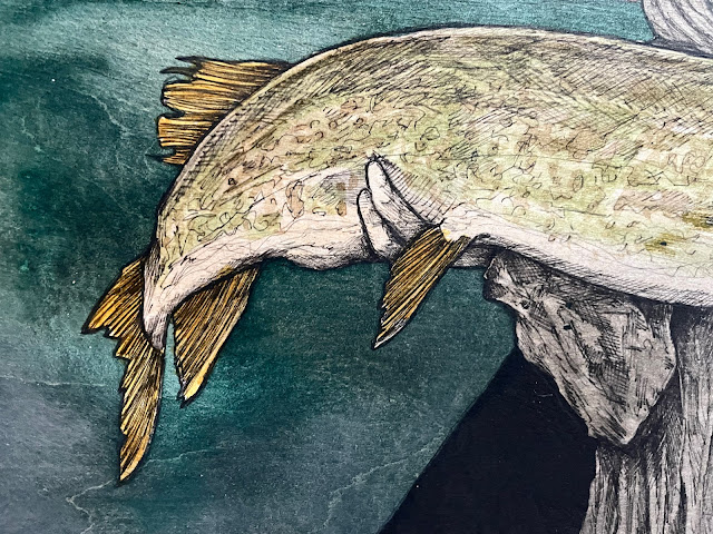
The mind of artist Jake Keeler is an ever interesting place and his artwork is a reflection of the seen and his deep depth imagination. I asked if he'd chronicle a recent artwork piece with a few photographs and he did much more with giving the background of the steps that go into a commission.
Take this in and it's also neat to see artists supporting other artists as this commission was done for Matthew Stockton to celebrate a monumental muskie. Honestly, they all are something special.
Jake wrote... "Commissions are something I’ve done from a very early time as an artist if I count drawings made for friends back in middle and high school. I’m not sure I got paid for those gigs, but they were nonetheless a blueprint for how I approach them today.
Since then, I’ve done everything from simple illustrations or quick sketches to more complex bodies of work for album covers and inserts that require a good deal of collaboration, communication, and thoughtful decisions to an end product.
Through this range of work, a few key conditions have become standard in my commission work:
"So, with that as the backdrop, let’s break down the process behind a recent commission!
A good buddy and fellow fish-artist Matthew Stockton had pinged me about a commission. He’s commissioned me before, and we’re fans of each other's work. I dragged my feet committing to the project due to time constraints, but thankfully he was pleasantly persistent and we got the project on the books.
Through this range of work, a few key conditions have become standard in my commission work:
- I only do work that reflects my style and subject matter. In other words, I don’t do work that “looks like so and so’s..”, or venture into subject matter I am not intimately familiar with. The reason is that all of my most successful commissions, and happiest clients, are a result of me getting to make what I LIKE, which in turn is also what THEY LIKE.
- I’ve learned it pays to be transparent about my process! An open and honest dialogue about point 1 with a prospective client makes sure that project gets off on the right foot, or, they avoided altogether saving both me and client time and energy. It’s a “no harm, no foul” scenario and I’ve found it to be critically important.
- I get paid, and I’m not afraid to charge a high but fair rate. I base this on going prices for which I've been paid or my general work is sold.
- Time is fluid, and so to the timelines of a commissions. I’m not a full time artist, so I only have a handful of hours per week to get in the studio. Someday, somewhere, this dynamic will change, but for the foreseeable future my time is the most variable part of the equation."
"So, with that as the backdrop, let’s break down the process behind a recent commission!
A good buddy and fellow fish-artist Matthew Stockton had pinged me about a commission. He’s commissioned me before, and we’re fans of each other's work. I dragged my feet committing to the project due to time constraints, but thankfully he was pleasantly persistent and we got the project on the books.
Part of taking on a commission is asking a few simple but critical questions; things I need to know before I even start sketching something out:
SIZE
Matt wanted something in the small-medium range, so we shot a couple options back and forth and settled on the size. I knew this piece would be on a wood panel as well.
IMAGE/SUBJECT MATTER
Matt already knew the image - him holding a memorable muskie; he sent a good quality digital image immediately.
DATELINE/TIMELINE
In this case, Matt had no due date in mind, he wanted me to take my time and create something I felt stoked about.
The first step is prepping the panel, which involves laying down a diluted coat of Matte Medium. The reason for this is to prevent inks from bleeding; different wood types/grains can bleed more than others, but this quick and simple step is important is setting the stage.
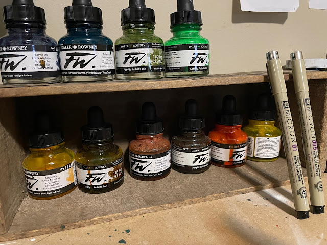
Next I lay out the basic composition based on the photo. Using a light pencil density like 5-6h is key, allowing for quick corrections and erasing without leaving behind faint lines. Once the essential lines are blocked, I go over them with a pen. I use Pigma Micron pens exclusively now. I’ve used various other brands, but I always come back to Microns; consistent, easy to find/purchase (this is important because I go through so many), and the black seems a little less saturated giving it an almost pencil like quality. Typically those first blocked in lines are with a 01.
I added a sun-dial behind the figure, and of course a skull vs. Matt’s handsome mug - that’s where the artistic liberty starts. It’s a small left turn that makes my art…mine. I then added the black circle, triangle behind the body, and fluid line pattern. These are all staples in my toolbox, like Bob Ross’s frosty mountain tops of happy trees."
"From there I start laying down color with Daler Rowney drawing inks. I have used watercolors and I’ve used gouache, but like the Microns, I always come back to these inks for the same reasons. For color choices on this piece, I wanted realistic colors for the muskie, but took more liberty with the sky, water, clothing, and the blazing “sun”. I wanted high saturated colors that would pop. I did this because Matt uses highly saturated colors in his own work, so this was a little bit of a nod to his own aesthetic.
After the composition is set, the colors are set, the pen work begins. This is usually 005, then diameter line work. I should mention that the prior steps can happen somewhat interchangeably, but I find if the process flows orderly, it allows me more freedom to enjoy the pen work and vibe-out a bit. This is important as the pen work can become super laborious, a grind, so being able to riff a bit and push a few ideas around keeps the interest intact and makes sore fingers/wrist worth it.
Important to mention that I’m always listening to music when I’m making work; for this piece it was a rotation of Elder, Yob, and Howling Giant.
Throughout the creation of the piece, I was sending Matt updates and progress shots - I like sharing the journey and seeing the feedback. It helps keep the excitement levels up when I can see the recipient getting stoked.
Once the pen work is done, I may do a few color touch ups, add a few lines here and there…but I always know when to say enough is enough. I then take it outside and apply a Matte spray fixative. This is needed before applying a liquid varnish, otherwise it may pull ink from the pen or even residual graphite from the pencil work. After that dries, I apply two coats of acrylic Satin Varnish. This gives the finished piece a protective UV barrier, and makes it super easy to clean - it also helps the color and marks pop. I prefer the Satin finish, not dull, and not too shiny as to create sheens or reflections. It’s a happy spot.
Last step was to send some images to Matt and get the piece packed and shipped out.
I was really stoked on how this piece turned out. It was an ideal commission, and even helped me break a little creative funk. Projects like this can really help break inertia and give me the proper amount of momentum. Art gives so much, and I need to be reminded of that sometimes. I feel pretty lucky that people dig my work enough to commission my imagination and skill; that’s pretty rad."
Interested in seeing more of Jake Keeler's artwork? Visit his website, Etsy, Facebook, and of course, Instagram.


No comments:
Post a Comment